.png)

“Do two different methods give me the same result?”
Bland-Altman plots are a way to assess how measurements from two different methods agree, and whether that agreement varies across the range of values being measured.
Why does this matter?
Let's say you're a doctor deciding whether to replace your clinic's blood pressure machine with a newer, budget model. You run both on the same patients and they correlate beautifully — R² = 0.98. Looks good, right?
Not so fast.
Correlation only tells you that the two methods move together. It doesn't tell you if they give you the same numbers.
As you can see in Plot 1, the data points track almost perfectly along the trend line, but that says nothing about whether the actual readings match.
That's where the Bland-Altman plot comes in. Plot 2 tells a very different story: the new machine reads on average +14.5 mmHg higher than the clinic monitor every single time. If you swapped machines without knowing that, you could be diagnosing patients based on systematically wrong readings, and a correlation plot would never have caught it.
That's the problem BA plots were built to solve. Instead of asking "do these move together?", they ask: can I actually use these two methods interchangeably?
In this article, we'll walk through the equations behind BA plots and use a hands-on example , comparing blood pressure readings from a home cuff vs. a doctor's office cuff, to show you how to build and interpret one.
Example: Blood Pressure Monitor at Home vs. Doctor’s Office
Let’s say you want to compare two blood pressure monitoring methods: a cuff at your house vs. at the doctor’s office.

First, we’ll take readings on each machine across 8 days.
To generate a BA plot, we calculate the mean and difference for between each reading:
Interpreting the BA Plot
Some quick observations:
- All the differences are positive, meaning the home cuff consistently reads higher than the doctor’s office monitor
- Moving right on the x-axis = higher average blood pressure readings across both methods
- Moving up or down on the y-axis = larger or smaller difference between the two readings at that point
What happens if the LoA and bias change?
Let’s go through some scenarios to see how changes in the bias and LoA impact the interpretation of Bland-Altman plots.
Bias near 0, wide LoA
In the scenario below, while the differences between the two cuffs are minimal, the wide LoA readings indicate that the individual readings vary significantly and the methods are not interchangeable.
Bias near 0, tight LoA
This is good! The home cuff and the doctor's office cuff almost always agree. The differences are small and stable across all readings. You could confidently use either one of these methods interchangeably.
Bias away from 0, wide LoA
One method reads consistently higher over the other. In this case, the home cuff tends to read higher, but by how much varies wildly from day to day. On Day 3 it's only 1 mmHg off and on Day 8 it's 13 mmHg off. This implies that the methods cannot be used interchangeably.
Bias away from 0, tight LoA
One method reads consistently higher and there’s minimal changes across readings. You could correct for this mathematically but the methods are not interchangeable as-is.
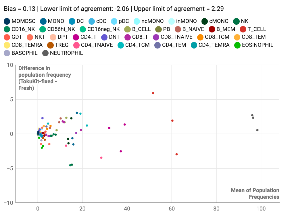
How we use BA plots to support clinical trials.
At Teiko, we use Bland–Altman (BA) plots to compare immune cell frequencies between whole blood fixed with TokuKit, a blood preservation kit used in over 80 global sites today, and fresh samples collected within hours of a blood draw. It's a clear, quantitative way to assess how similar these samples are — and whether TokuKit-fixed whole blood can serve as an alternative to fresh (spoiler: it can).
With the bias close to 0 and tight LoAs, you can see that TokuKit-fixed samples and fresh blood samples demonstrate high concordance across immune cell population frequencies, implying that the two methods are nearly interchangeable.
If you want to learn more, reach out: info@teiko-labs.com
.png)


