Cytometry results you can understand, immediately.
Immune readouts your team can act on the day they arrive.

.gif)
We answer the questions translational teams ask
What's changing in response to my drug?
At a glance, quickly see the biggest statistically significant changes in response to your drug.
Is this real, or noise?
Assay noise bands drawn directly on every Immune Changes plot.
What does this mean for the patient?
An Artificial Immunologist annotates every chart in plain English.
What is driving the difference?
PCA, UMAP, and a clustered heatmap. See the whole study in one view.
Can I hand this to my biostat?
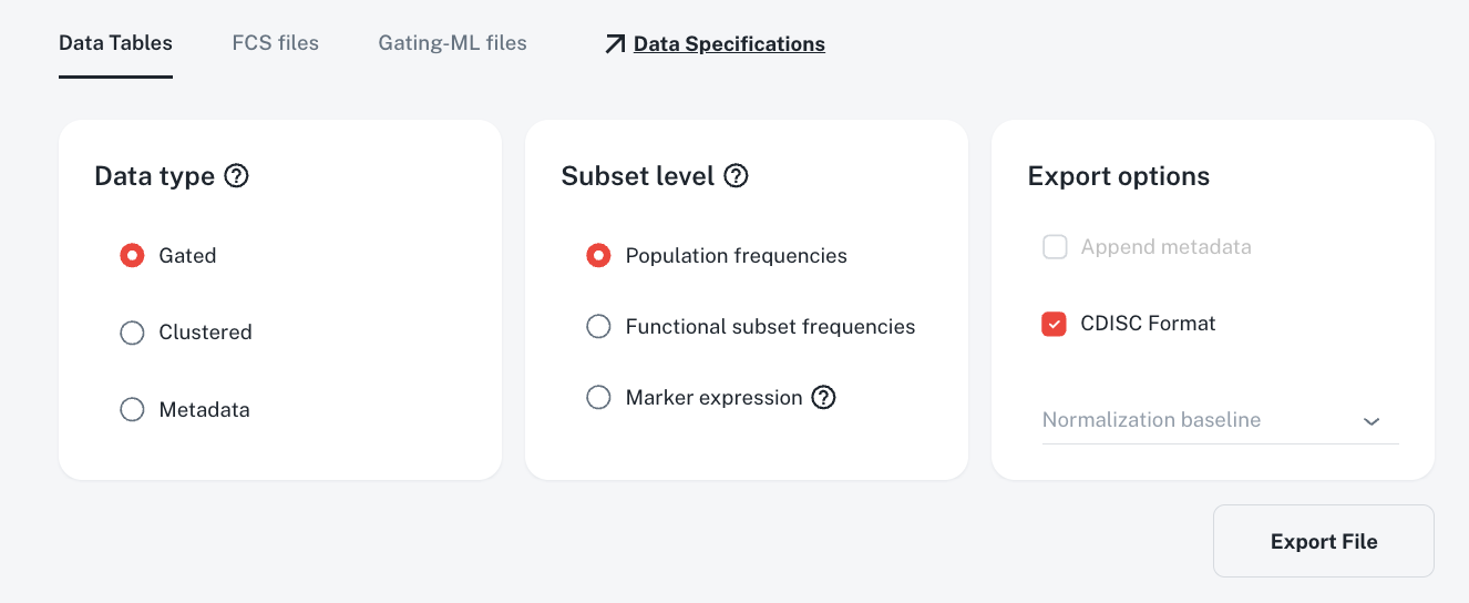
One-click export of a CDISC SDTM package, plus FCS, GatingML, QC.
What's changing in response to my drug?
Every population-and-marker comparison in your study is scored and ranked by effect size and false discovery rate (FDR). The top 100 are summarized in one table, so the biggest statistically significant changes surface without an export. Each row links to the plot behind it.
Intuitive for a “dumb biologist.” It is really powerful, to be able to see all these things together.
Existing customer
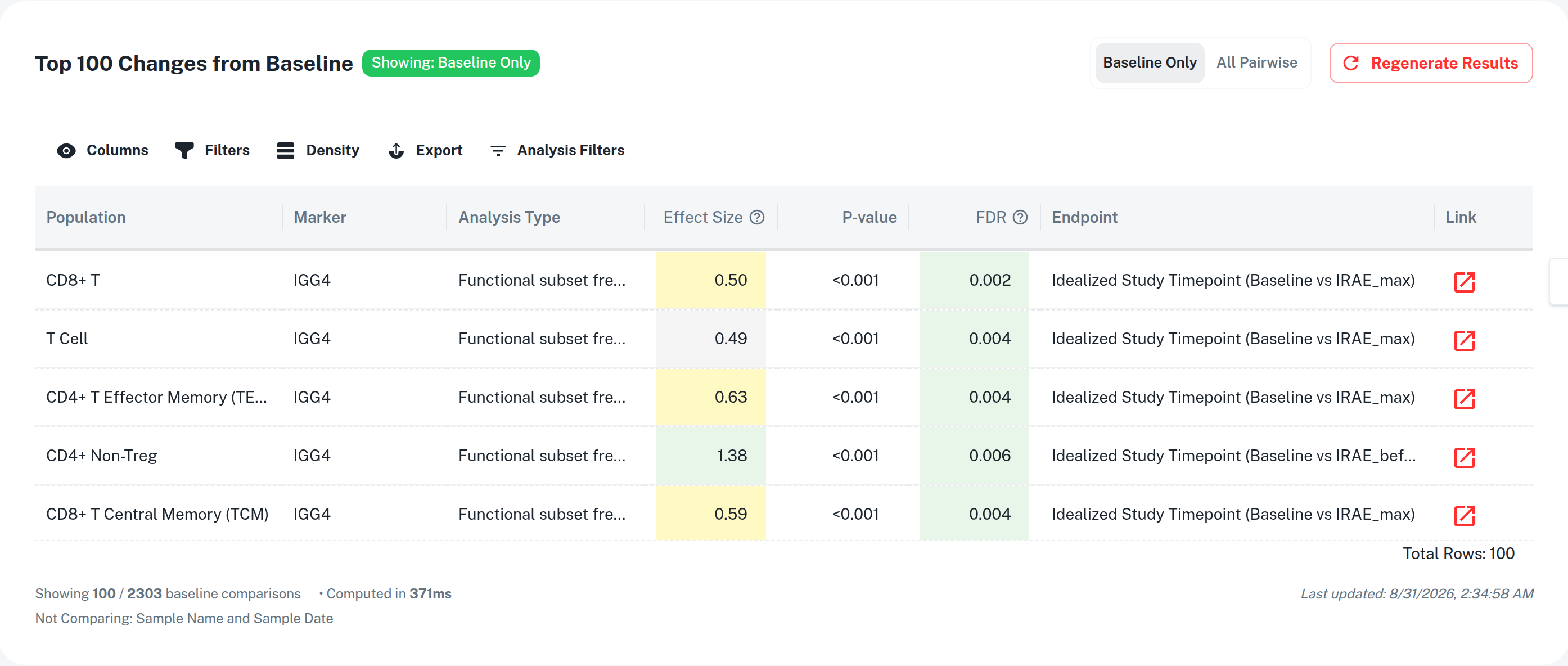
The 100 largest changes from baseline, ranked by effect size and FDR.
Is this signal, or assay noise?
Every Immune Changes boxplot carries a noise band drawn from your panel's CLIA-level validation, or, on request, your study-specific qualification. A difference that clears the band is signal you can defend.
Those CVs are really impressive.
Head of biomarkers, $30B prospect
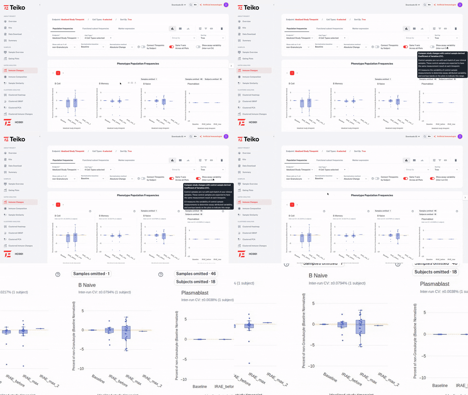
Same boxplots, band off and band on. A difference inside the band is assay noise.
An immunologist beside every chart
The Artificial Immunologist annotates every view in plain English: what changed, why it likely changed, and what to look at next. Hand the dashboard to a clinician and the chart explains itself.
I wish I had this 15 years ago.
CSO, $4B immunotherapy developer
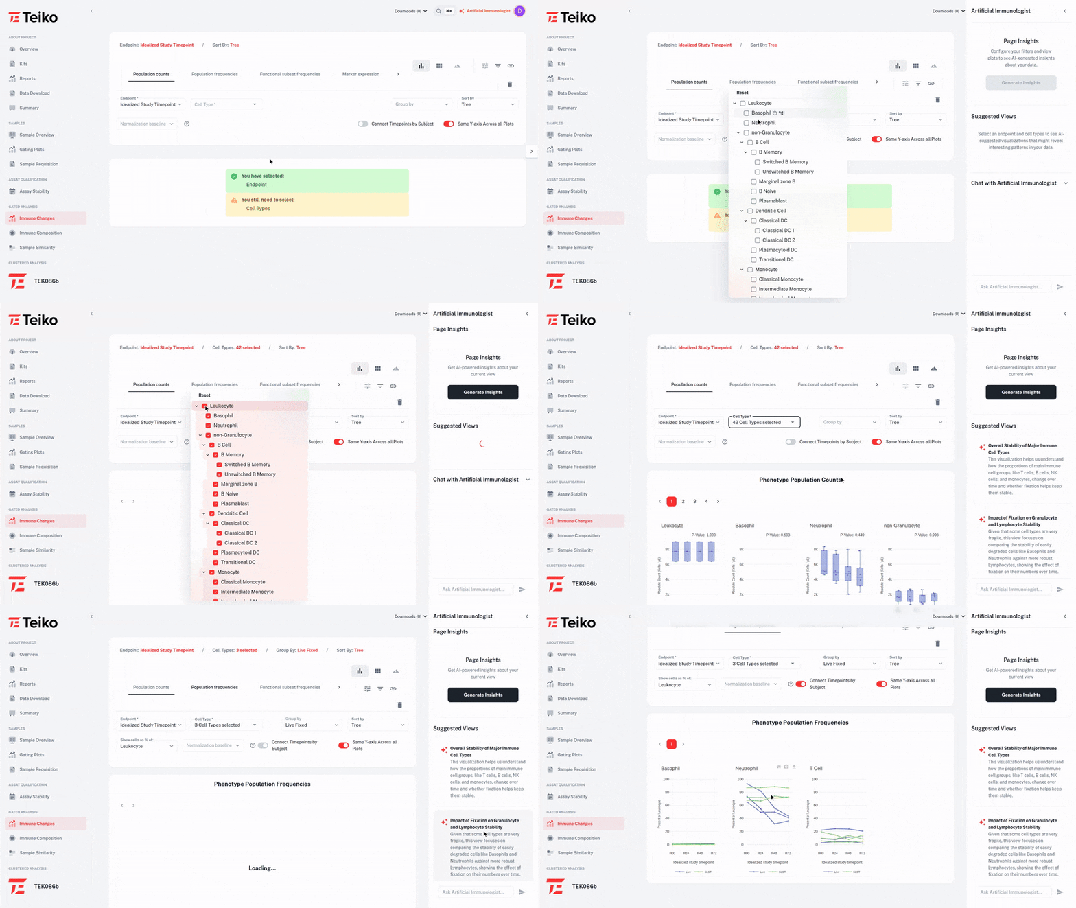
Suggested Views proposes a comparison; one click builds it — fixed versus unfixed frequencies across 72 hours.
See the whole study in one view
Use advanced visualization tools like Principal Component Analysis, Heatmap Readouts, and optionally UMAP (for clustered datasets), to uncover patterns across markers, subsets, and patients.
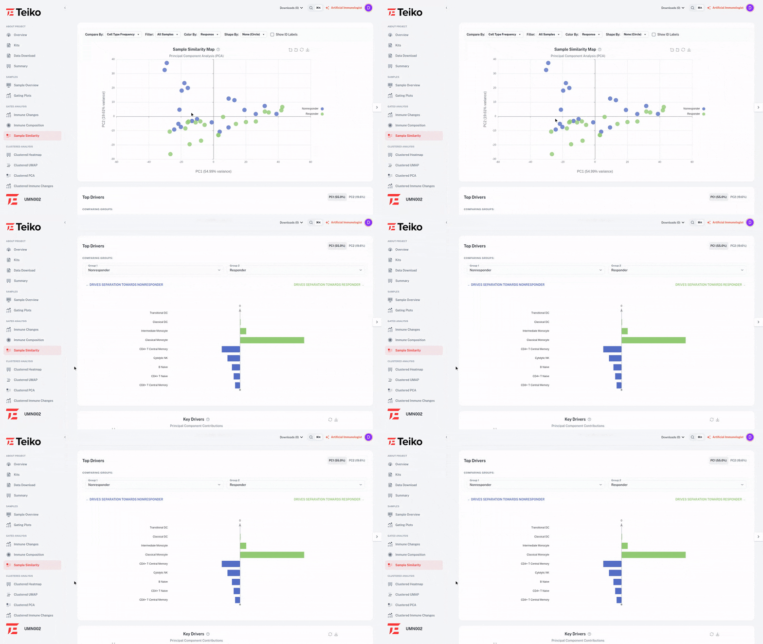
Principal component analysis
Two axes that explain the most variance. Responders pulling left of non-responders on PC1 is your first clue.
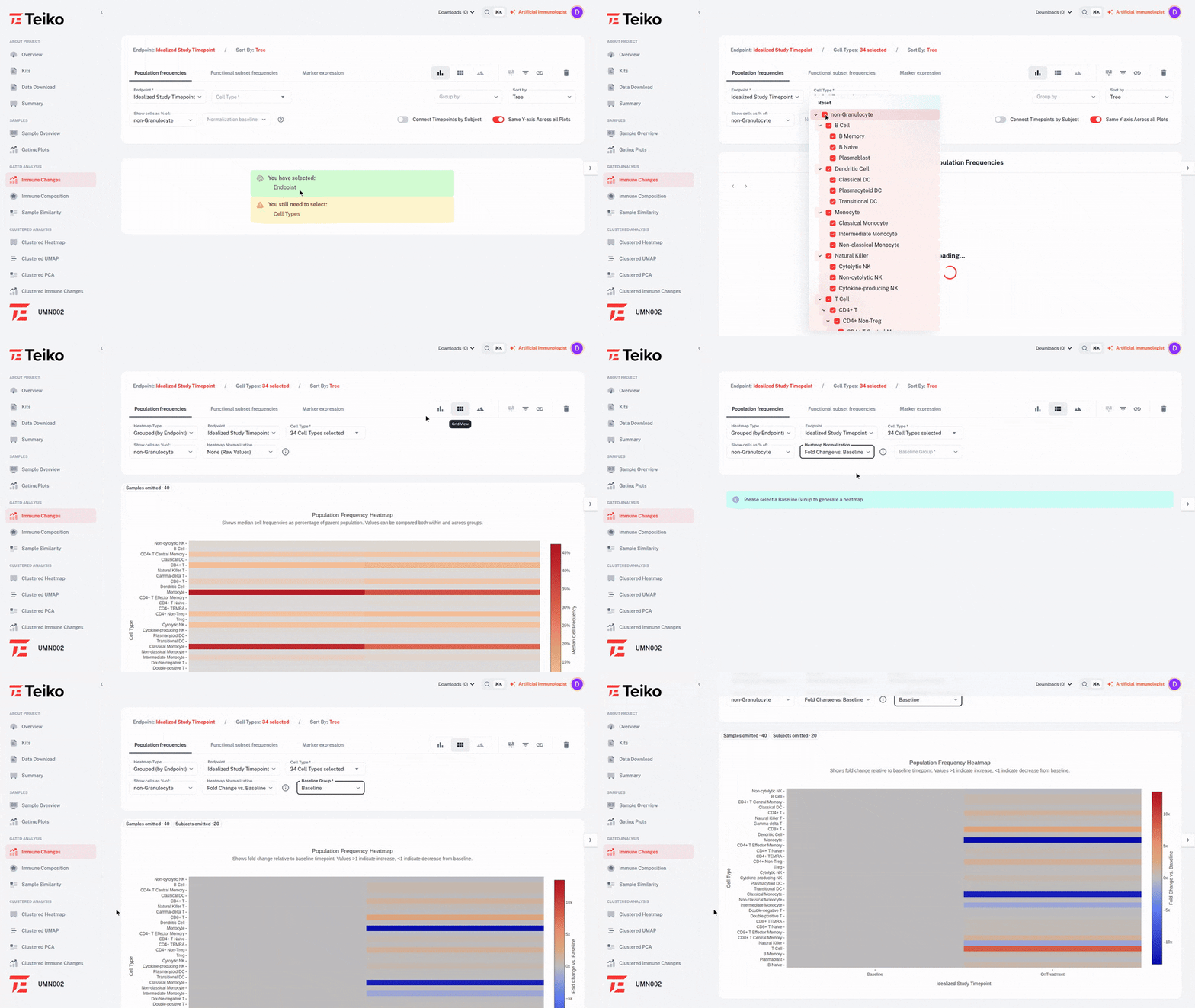
Cluster heatmap
Markers by subsets, sorted by how strongly each separates outcomes. Diverging two-color, no rainbow.
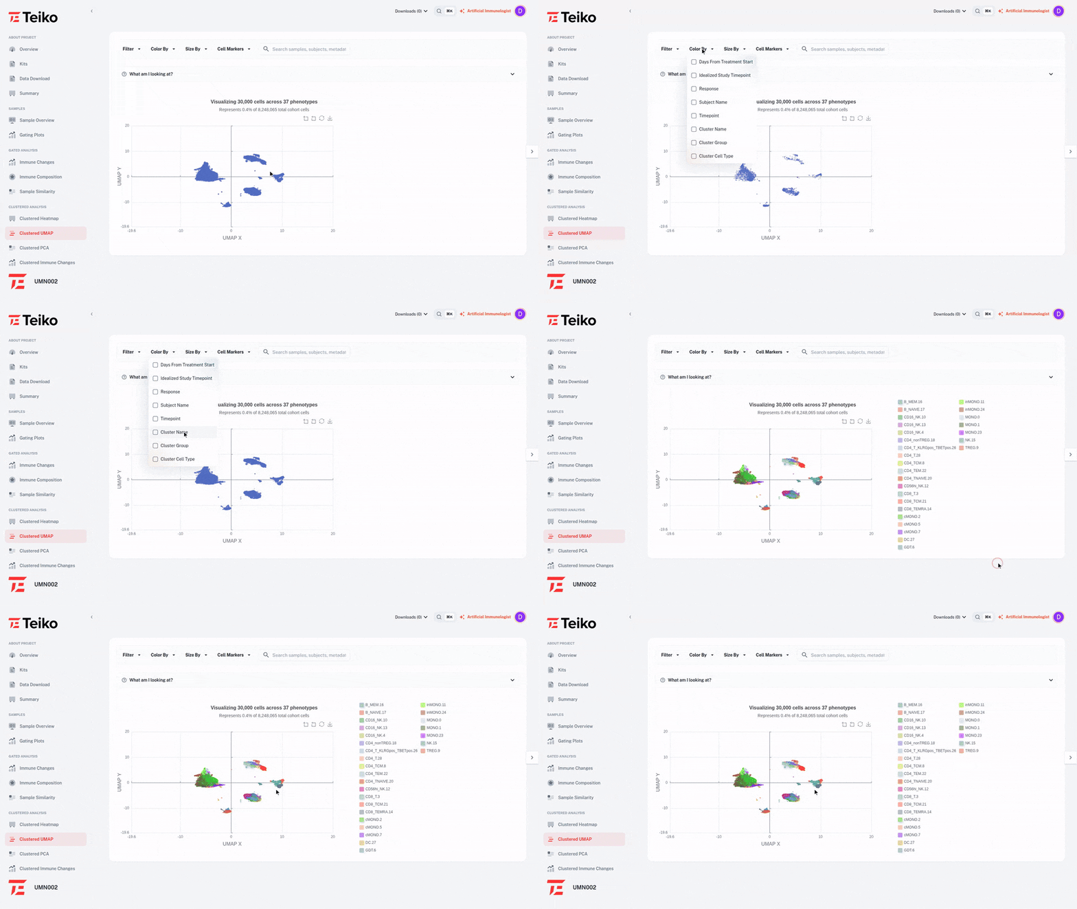
UMAP
Find rare populations that ran past your gating tree. Click a cluster to add it as a population.
CDISC-formatted by default
We support export to CDISC SDTM column structure on a custom CP (Cell Populations) domain. You also receive FCS and GatingML files, in case you want to inspect the data in your flow cytometry software.
Extremely happy with the quality of data. We want to work with you long-term.
Translational scientist, $100M financed Phase 2 company
- TEK086b_gated_population_frequencies_cdisc.csvgated population frequencies
- TEK086b_gated_cell_state_cdisc.csvgated cell-state breakdown
- TEK086b_gated_marker_expression_cdisc.csvgated marker expression
- TEK086b_fcs/one FCS per sample
- TEK086b_gatingml/GatingML 2.0 per sample
Cytometry results your team can act on
See demo datasets on the dashboard today.